The Color Dare this week is to use Pacifica (yay!)...........and.......Sorbet (gasp!) I cringed when I read it. (Sorry, Sarah!) I know some of you just did too. Now, take a breath. Exhale. Stay with me here--we each have certain colors that sort of turn us off. Peachy shades kind of do that to me, so Sorbet is not a color I reach for when I am freestyling, lol. BUT, I gave it a whirl and the more I thought about it, the more I lost myself in the design. I hope you like it!
I finally got my little hands on one of Close to My Heart's new My Creations Canvas Journals. Then I added Bamboo, Desert Sand, and Chocolate as my neutral colors, and WALLA!!!!! Take a look at what I did to it...
The beautiful blue ribbon is from the retired Designer Ribbon Blue Collection. Keep an eye out in my While Supplies Last section of my website, because you never know what awesome things will pop up in there! The red ribbon is currently available at a crazy-cheap price!
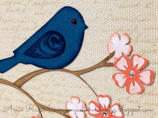
The adorable bird, branches, and flowers are cut on my E2 using the Art Philosophy Cartridge. The flowers were incredibly fun to play around with while I was trying to figure out how to make them. I inked some with Sorbet Ink and my sponge dauber. Bitty sparkles gave them just the right amount of bling. The bluebird has a chocolate color Opaque for an eye.
These great embellishments are found in two of the fabulous Mini Medley Collections. The button and flourish are in the Antiqued Gold Collection and the hemp baker's twine is found in the Wooden Collection.
This fancified paperclip was the perfect addition as a little place-keeper accent for my journal. You can find it in the Mini Medley Accents Antiqued Gold Collection as well. I added a bitty sparkle to tie it in with the blooms.
Can you see the faint script background image? I used the Universal Backgrounds My Acrylix to stamp it in Bamboo all over the journal front. The canvas on the journal gives all the inking a softer, distressed look that I just adore. I used the Love Blooms My Acrylix stamp to stamp the sentiment in Chocolate at the bottom edge. I think it is perfect for a journal!
Alright, now, I hope I convinced you to try out this week's Color Dare over at Color My Heart. I cannot wait to see what you all make!


Amie, I really love what you did with the journal! The bird and the branch with the blossoms are perfect. And yes, I can see the background script, it caught my eye right away. It's gorgeous! I really hope you'll like this color combo, because you made it look fabulous!
ReplyDeleteNo offense, Sarah! Thanks so much--I am trying to get over my negativity to Sorbet, I really am! Perhaps this is the best type of therapy, lol! ;)
DeleteThis is a gorgeous project! I'm so glad you stretched yourself and went outside your comfort zone! It really paid off! (Ok...so you're not the only one who uses lots of exclamations) ;) Thanks for joining us at Heart 2 Heart :)
ReplyDeleteSo glad to know I am not alone! (yep, did it again!) Thanks, Tamytha! ;) I am a huge fan of your work...you are very talented indeed.
DeleteJust another beautiful project you created! I am so with you on the peachy colors, they are slow to grow on me too. :)
ReplyDeleteHey there, Steph--glad to know I am not alone! Thanks! :)
DeleteWell now isn't this a stunning creation!!! I never would have guessed peachy colors turned you off because this is soooo beautiful! Way to go!
ReplyDeleteLinda
Hee, hee! Thanks, Linda--I did only use a bit of the Sorbet as an accent color, but it is definitely there! ;)
DeleteThe journal is fantastic! I like all the details very much. Great job.
ReplyDeleteThanks, Pam! :)
DeleteLovely journal cover! I like the use of Pacifica and Sorbet with the canvas cover. Your embellishments really enhance it. thanks for taking the time to so thouroughly describe each step of your wonderful creation!
ReplyDelete:) Marie
Thanks, Marie...I was in a talking mood that day, lol! ;)
DeleteBeautiful job embellishing the canvas journal! I esp like the muted all-over script, the blue-bird and the metal accents. Personalized albums make such great gifts, too. I am liking this blue and (let's call it like it IS!) orange combo a lot, after seeing everyone's creations.
ReplyDeleteIt is kind of funny, but I never once thought of it as blue and orange--those are our high school colors too! Thanks so much! :)
Delete